Likes:
  Faceplams:
 Got mine today!! Just took a photo with all together.
The purple credits card does have a VERY faint NIN logo on the back, can barely even see it in good lighting, at least with my kitchen lights anyway.


 Throbbing Member

Got mine today!! Just took a photo with all together.
The purple credits card does have a VERY faint NIN logo on the back, can barely even see it in good lighting, at least with my kitchen lights anyway.
Stubby Member
I really dig mine, kind glad my credits aren't landscape, but disappointed my credits card shows no sign of halo 29. I've looked "so hard... so long..." but it's not on mine.
Sent from my iPhone using Tapatalk
Stubby Member
I'd prob trade she's gone away cards with you if we're ever around each other. You get to the twin cities much? I see your in Madison. My brother went to school there and his family in law is in Oshkosh.Originally Posted by GentlemanLoser

https://goo.gl/photos/PE6eqdCnrkMjPFiR8
Sent from my iPhone using Tapatalk
she/her/hers

http://eversonpoe.tumblr.com/post/157929263233
there's my whole set of pictures (which my wife patiently took while i carefully opened and inspected everything with rubber gloves). of course we listened to the EP (again) while going through the process. it was really fun.
of note:
- i could not see the NIN logo or halo designation anywhere, but it's possible it might be there in better lighting
- i got an extra "the idea of you" page...which is pretty freakin' cool
- i think this is one of the coolest ideas to accompany music that i've seen in a while, and i can't wait to get frames
 Stubby Member
Every time I see this one
I want to put on a pair of these


Active Member
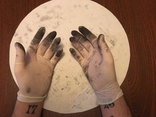
My component came in today. It had a sticker that said "do not open this will make a mess". My dad insisted to open it. Fuck it, why not. I thought nah, it's probably a gimmick. Nope. No gimmick. Whatever the black envelope is/was made of got all over our hands and kitchen counter.
I really have no words to describe what I think of this 'physical component' but what the fuck?
pretty FART machine

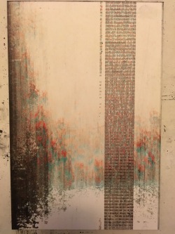
Please forgive the unartistic display, but here are my NTAE cards:
The back of the credits card has the NIN HALO TWENTYNINE, but it's nearly impossible to discern:
I'm very pleased with the overall set, but I'm not into the Red "She's Gone" card (it's so hard on my eyes).
 Active Member
Working on putting up some 1600 dpi scans of two different sets, but my scanner is slow and kind of shitty...
Also, my horizontal credits page DOES have a logo on the back, but it's ridiculously hard to make out.
24.24.2.3171
Ah, good to know; looking forward to your scans! I'll update the description on there, thx.
Active Member
Here are some scans with my goddamn shitty scanner.
Second set coming in an hour or so.
24.24.2.3171
Last night I updated my variations index page (at http://apocalyptech.com/ntae/ ) with links to all the sources for the images, btw, so I feel a bit better about that. I also realized that there's probably no reason not to just throw that thing up on Github, so if you wanted your own local mirror of all that (including the script which generates the HTML), feel free to grab it over here: https://github.com/apocalyptech/ntae
I'd happily accept pull requests, of course, though I'll be continuing to monitor this (and other) threads for more images, so definitely don't feel compelled to do so if it's not something you'd naturally do anyway.
24.24.2.3171
Those aren't viewable by someone without a Facebook account, btw (or possibly without being Friended or whatever the hell Facebook does). Would you mind either changing the permissions on that set, or uploading 'em elsewhere as well? Thx!
Active Member
transparency
branches/bones 1 front

branches/bones 1 back
dear world, 1
she's gone away 1 front
she's gone away 1 back
the idea of you 1 front
the idea of you 1 back
burning bright 1
credits 1 front

Active Member
credits 1 back
transparency / the idea of you 1

 Administrator


I guess TR now collects every Physical Component owner's prints via these scans. Welcome to Year Zero.
Active Member
pretty FART machine
Thank you @xolotl for compiling all the images to catalog the variants! Does anyone remember seeing a print run for the Physical Component?
For simplicity, I'm going to speculate that Black on White is the main version (save for "She's Gone Away") & the other colors are secondary:
Transparency
NTAE_01
a. White card/Black text
b. Blue card/Black text
c. red splotches
NTAE_02
a. White card/Black text
b. Black card/White text
c. Green card/Black text
NTAE_03
a. Black card/White text
b. Red card/Blue text
NTAE_04
a. White card/Black text
b. Grey card/Black text (slightly different text layout)
c. Blue card/Red text
NTAE_05
a. White card/Black text
b. White card/Multicolor text
c. Black card/Pink text
Credits
a. White card/Black text
b. Blue card/White text
c. Black card/White text (landscape)
I'm guessing there are 3 random variants and we've yet to see the third version for "She's Gone Away."
Last edited by FULLMETAL; 03-04-2017 at 04:18 PM. Reason: paul_guyet's corrections.
Active Member
branches/bones 2
she's gone away 2
the idea of you 2 front
the idea of you 2 back
burning bright 2
credits 2 front
credits 2 back (faint logo dead center almost at the very bottom)
transparency / burning bright

Active Member
There are two black on white versions of "The Idea of You" with different font arrays, so I think that's all three. And there's a version of "Branches/Bones" with red splotches instead of black. "She's Gone Away" is the only one that hasn't had a third yet.
grrr. woof.
i got this variation. didn't take pictures, just wanted to clean up. i'm really happy with it, feels totally worth $12 and then some. that said, i put it back in the plastic sleeve and i have no intention of opening it again.
this whole thing makes me very excited for whatever might come. maybe nothing, but still ...
Down, but not out.
This thread seemed to be the right place to mention this particular thought concerning the physical component's black dust or powder. Anyway, I was just wondering if it's actually corn starch colored black. It also made me wonder if they're to represent the ashes of all the songs with fire and burning references in them as the remains of the idea of him.
Aside from that, I'm just thankful that I have been very much fulfilled upon receiving it, as it'll give me another way to enjoy Not The Actual Events in its entirety. As much as I still enjoy looking through CD cases and booklets, this certainly is yet another creative and brand new experience for me that I definitely appreciate. I also didn't mind the delays that much because I got used to things being postponed or simply not happening whenever it came to Nine Inch Nails, which as a result lead me to be very patient and accepting with whatever Trent Reznor does or doesn't do no matter how many times he might openly suggest or merely hint at any type of prospective release or tour.
I'm also pretty big on the whole "I'll only believe it when I actually see it." approach to such things, so it still gives me yet another reason to be thankful and appreciative, as I saw, touched and believed.
I suppose you can say that my faith and devotion to NIN is still going strong. I also thought to myself, with all the times I bought multiple NIN albums as presents, what's $12.00 without the physical component?
But again, it is quite a relief and pleasant surprise to have it, as I also enjoy the visual aspects of music, with further proof of the money being well spent, whether they be videos or album art even if I tend to block out images and videos from time to time while listening to music.
Last edited by Halo Infinity; 03-04-2017 at 10:25 PM.
24.24.2.3171
Yeah, I'd noticed that there seemed to be more than one font layout for The Idea of You, even though they otherwise superficially look quite similar. I hadn't yet looked closely enough to find out if it really was just two distinct versions or not; I'll probably end up splitting up my summary page to reflect that once I have a bit of time.
Edit: I wonder if there's a third variant for She's Gone Away but the difference is on the back of the card, not the front. We don't have nearly as many pics/scans of those yet...
Last edited by xolotl; 03-04-2017 at 10:52 PM.
she/her/hers
has anyone besides me gotten any extra pages? i'm certain it was just that the two pages were stuck together but i also think it's pretty awesome that i ended up with a variation like that.
Stubby Member
You are super special!
Active Member
They might make it a bit bulky and, you know, covered in fine, black powder, but, yeah, they should fit. They are just over 6 by 9 inches each
.
Stubby Member
@xolotl
I'm pretty sure that there are two different variations of the green card stock for "Dear World"
From what I've seen, some are bright green and some are dull green. Of course, I'm aware that different cammeras and or different backgrounds might affect the "green", however comparing the photos people have put up and comparing the white, blue, black, purple, etc within the same picture... I'm fairly certain that there are two different "greens". One is bright, and one is dull. The bright green is already documented. Here's an example of the dull green: http://www.pictaram.club/share/BRIyp4vlfXj
edit:

Last edited by bwary; 03-04-2017 at 11:22 PM.
 Stubby Member
Here's my version, back and front :
Close up here : https://imgur.com/a/nXuK3
There is a new line of lyrics in the second verse of The Idea of You :
GO BACK TO THAT IDEA
CAN YOU HEAR ME OVER HERE?
(TLEF UOY) YOU FEEL IT HAPPENING?
It's strange, because this line can't be heard in the song, it's not on NINwiki but we can find a variation of it on other lyrics sites like : http://www.azlyrics.com/lyrics/ninei...ideaofyou.html
This last variation ("Can't you feel it happening?") is also on other versions of the Physical Component.
Last edited by Dimitri.; 03-05-2017 at 08:17 AM.
Active Member
There are some lyrics on the "Burning Bright" sheet that aren't in the song either.
RA-MEN ROPPAI

I believe the substance is Lake Pigment:
"Lakes are often used to color food, drugs and cosmetics. For food coloring, lake pigments are used when other types of food dyes are inefficient. Specifically, when the food at hand lacks the appropriate level of moisture in which other types of dyes can dissolve, lake pigments are often used. Lake pigments are also used for coloring foods containing fats and oils. While both traditional food dyes and lake pigments are both oil insoluble, lakes are oil dispersible. Lakes are commonly used in personal care products such as lipsticks, eye-shadow, nail polishes, lotions and other cosmetics because of their chemical attributes and coloring qualities."
"Fats and oils" is bolded because fingerprints.
 Throbbing Member
This is the set I have too...I think these are really cool to be honest, good work team NIN/Kraw. Maybe still trumped by the Year Zero disc changing colour...!
Last edited by simonn; 03-05-2017 at 10:18 AM.

 Reply With Quote